


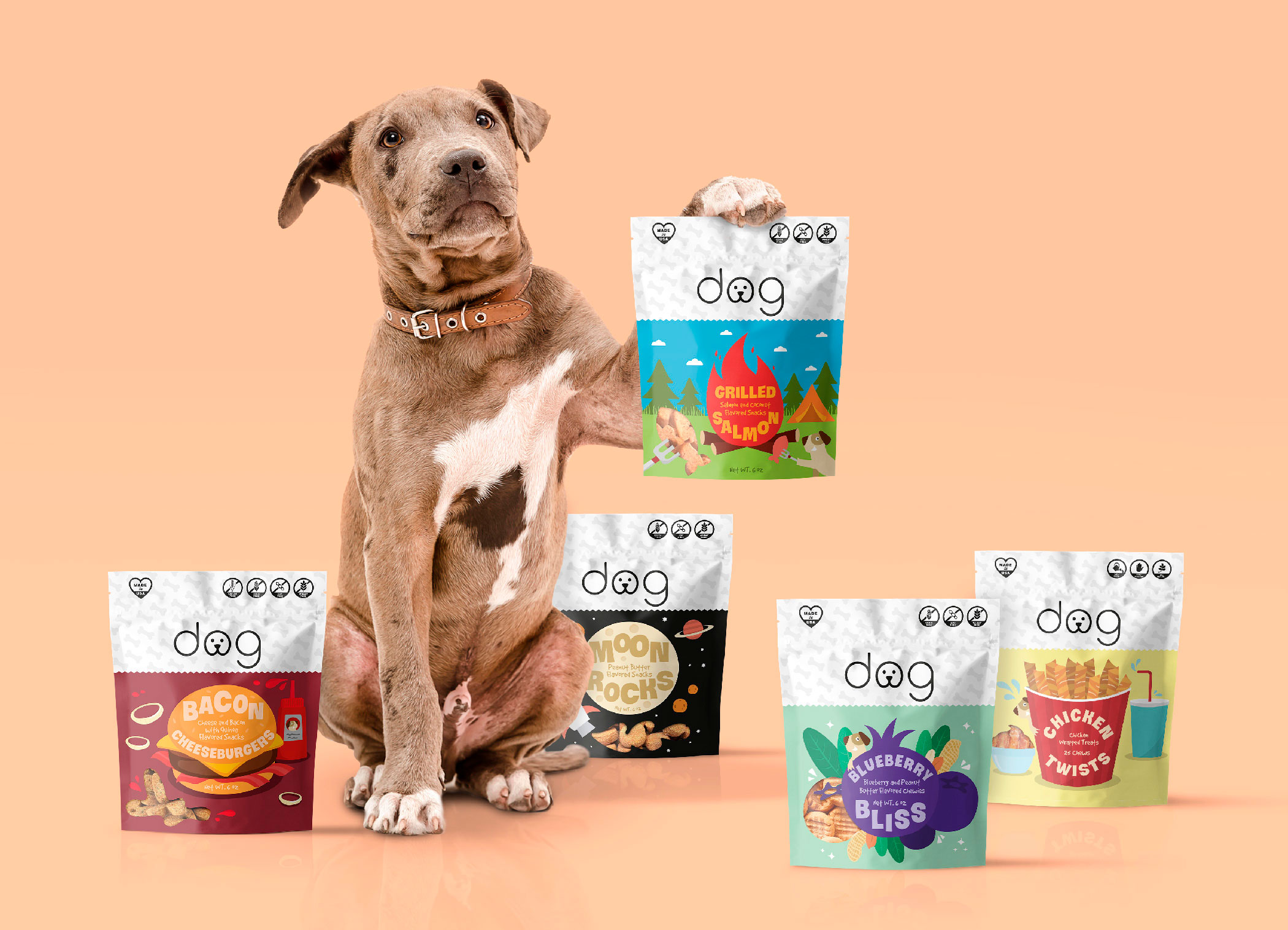
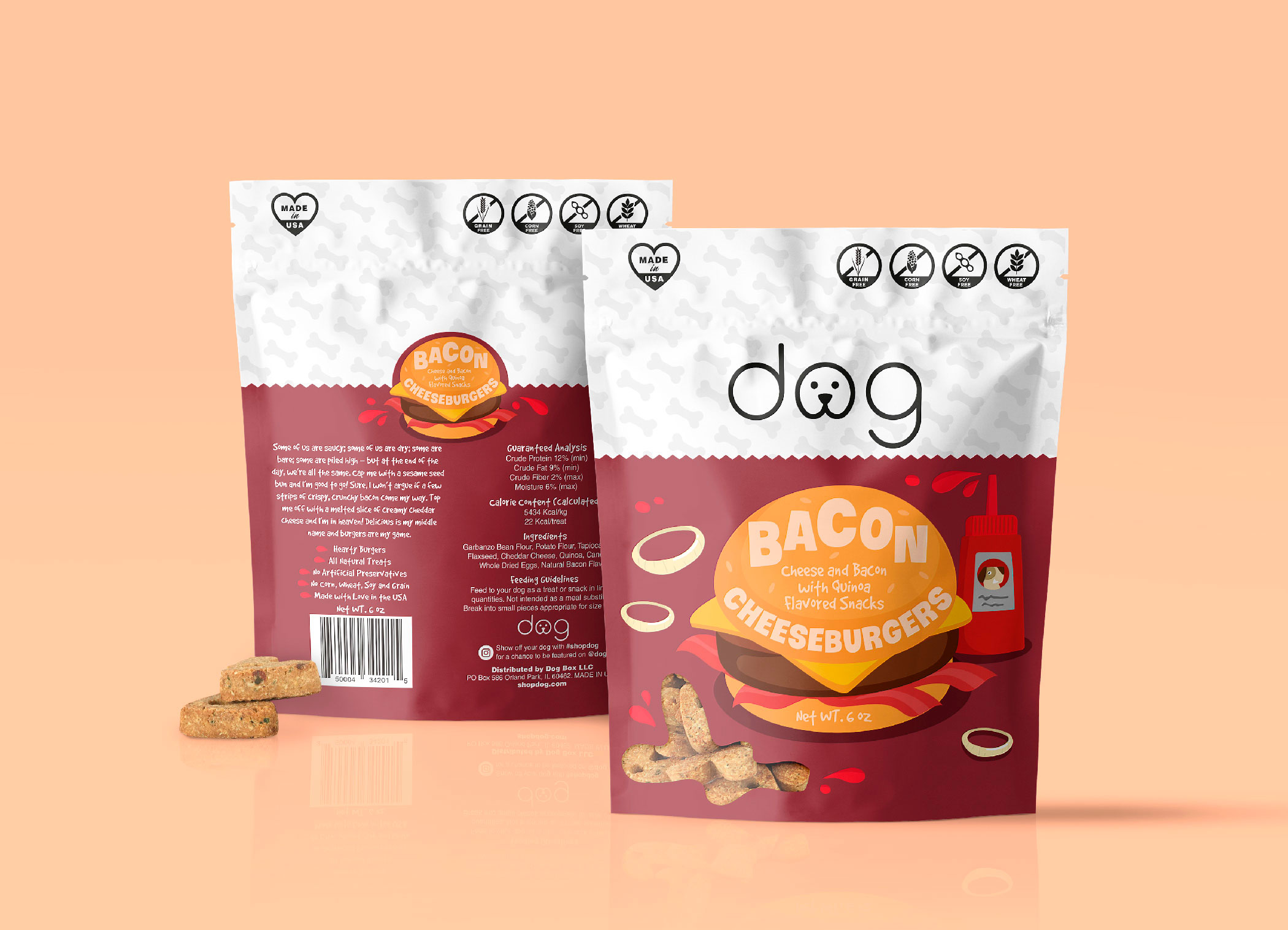
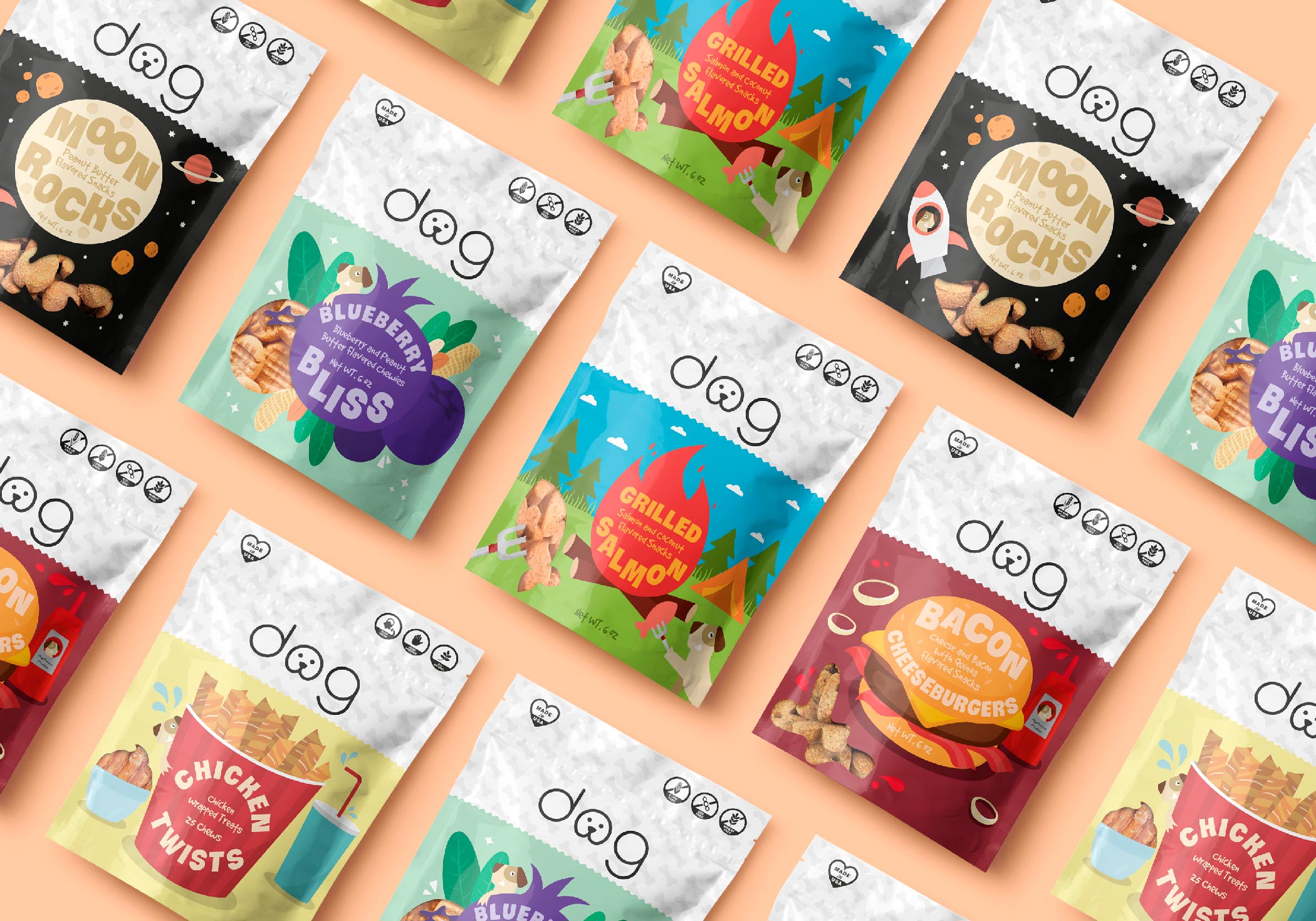
This project involved designing packaging for a collection of dog treats aimed at standing out on the shelf with a fun, modern, and approachable aesthetic. The brand identity is built around a clean, consistent system, with a dog-face logo that instantly conveys warmth and friendliness.
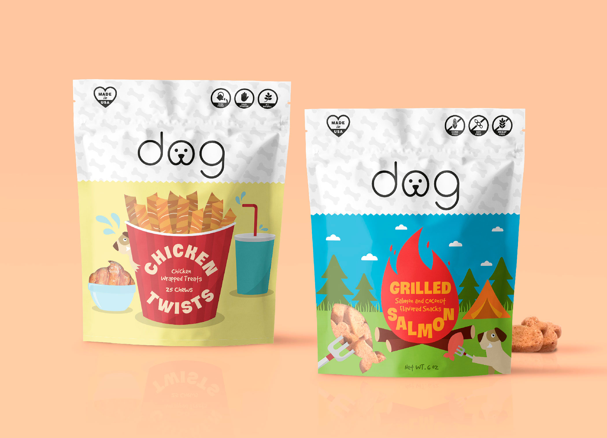
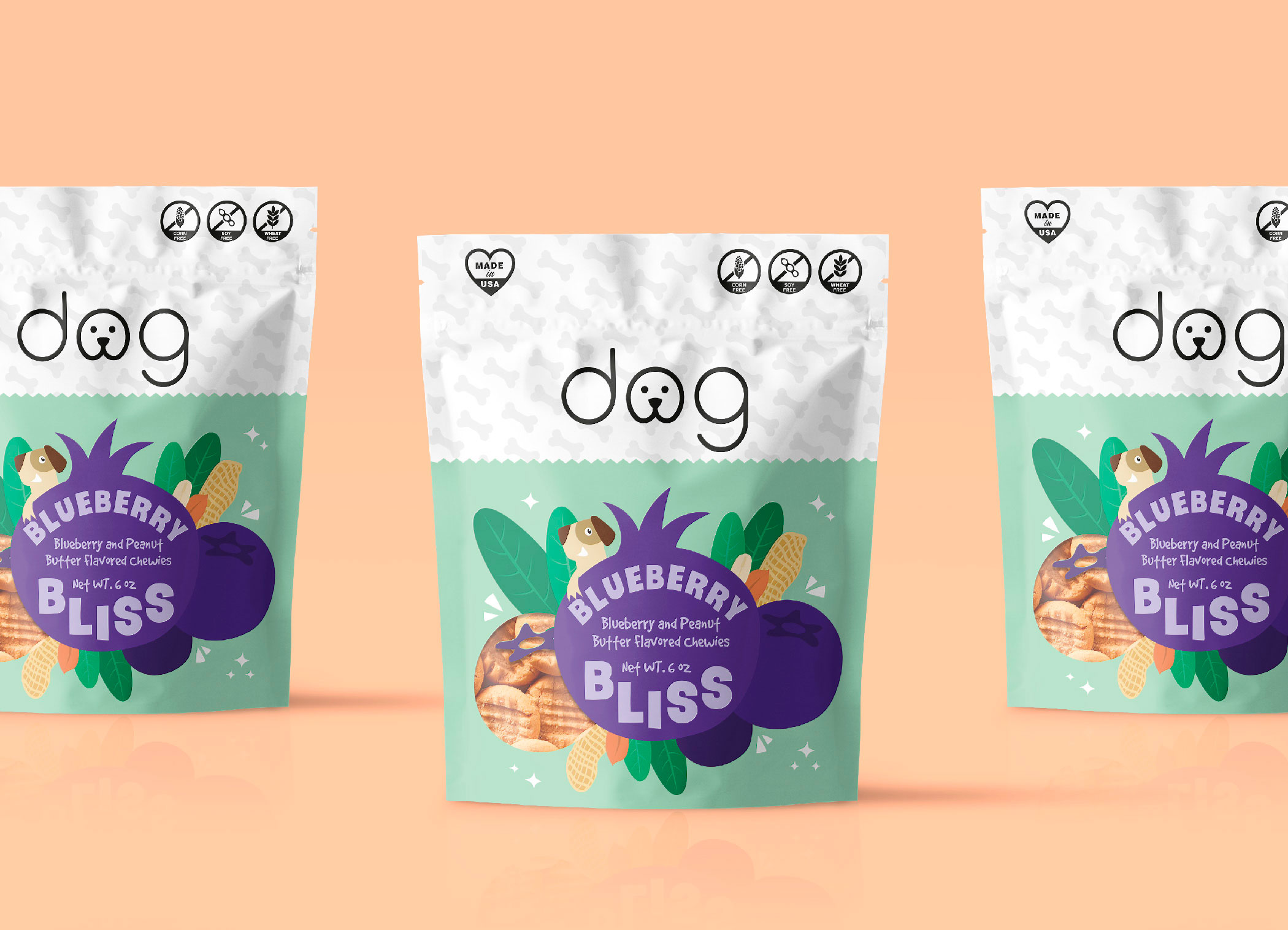
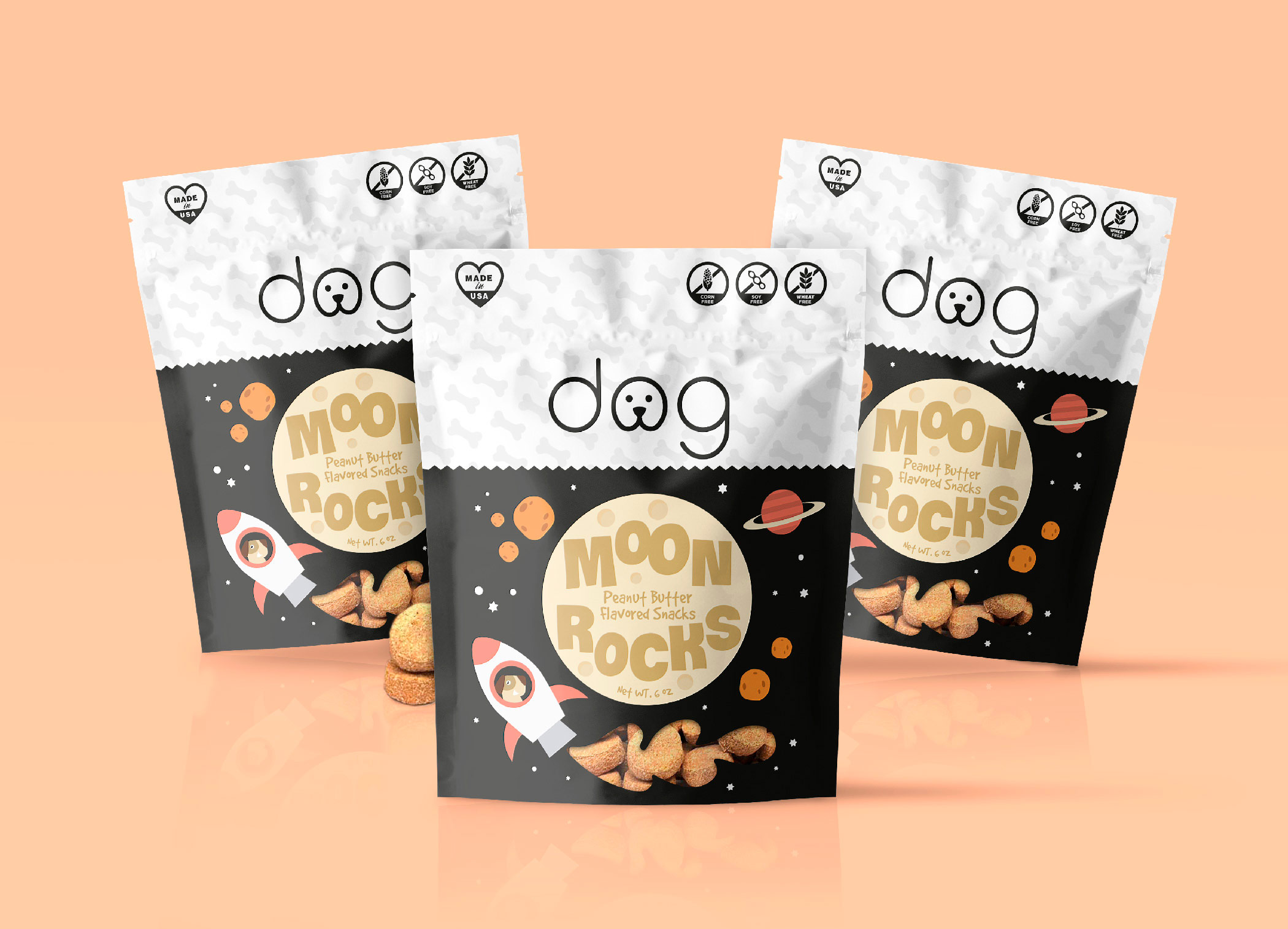
Each flavor comes with its own playful world: from the space-themed “Moon Rocks” to the fried-chicken-inspired “Chicken Twists,” each design uses bold illustrations and bright backgrounds to communicate flavor and fun at a glance. The white top with a textured finish adds a clean, professional contrast to the vibrant lower half.
Information is laid out clearly with easy-to-understand icons highlighting key benefits like natural ingredients, preservative-free, and suitable for all breeds. The result is eye-catching, functional packaging full of personality—designed to win the hearts of both dogs and their humans.