


For the development of the visual identity and packaging design for Toa Hemp—a refreshing beverage infused with hemp—we set out to build a brand that conveys vitality, naturalness, and a modern attitude, while maintaining clear functionality on-shelf.
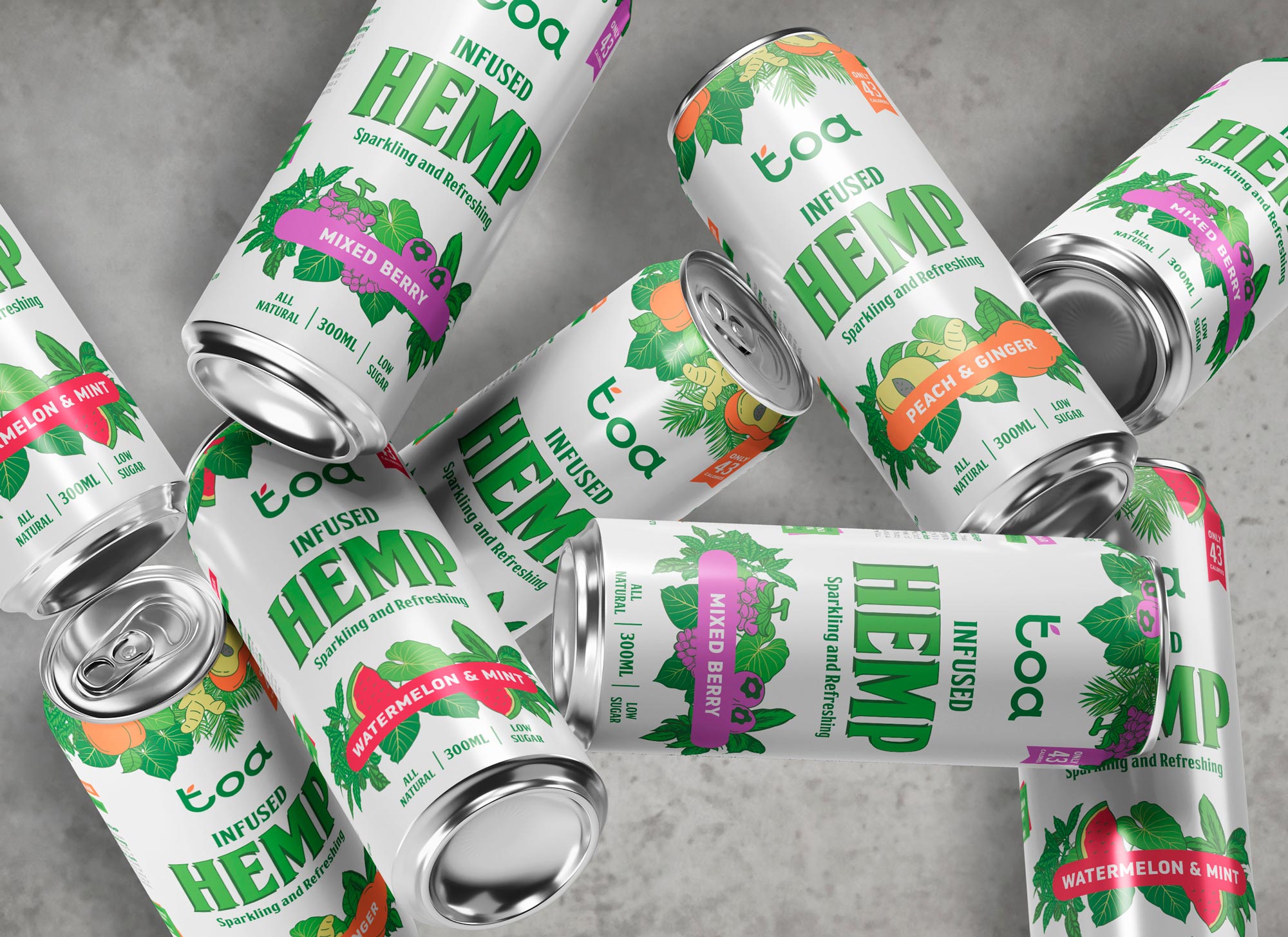
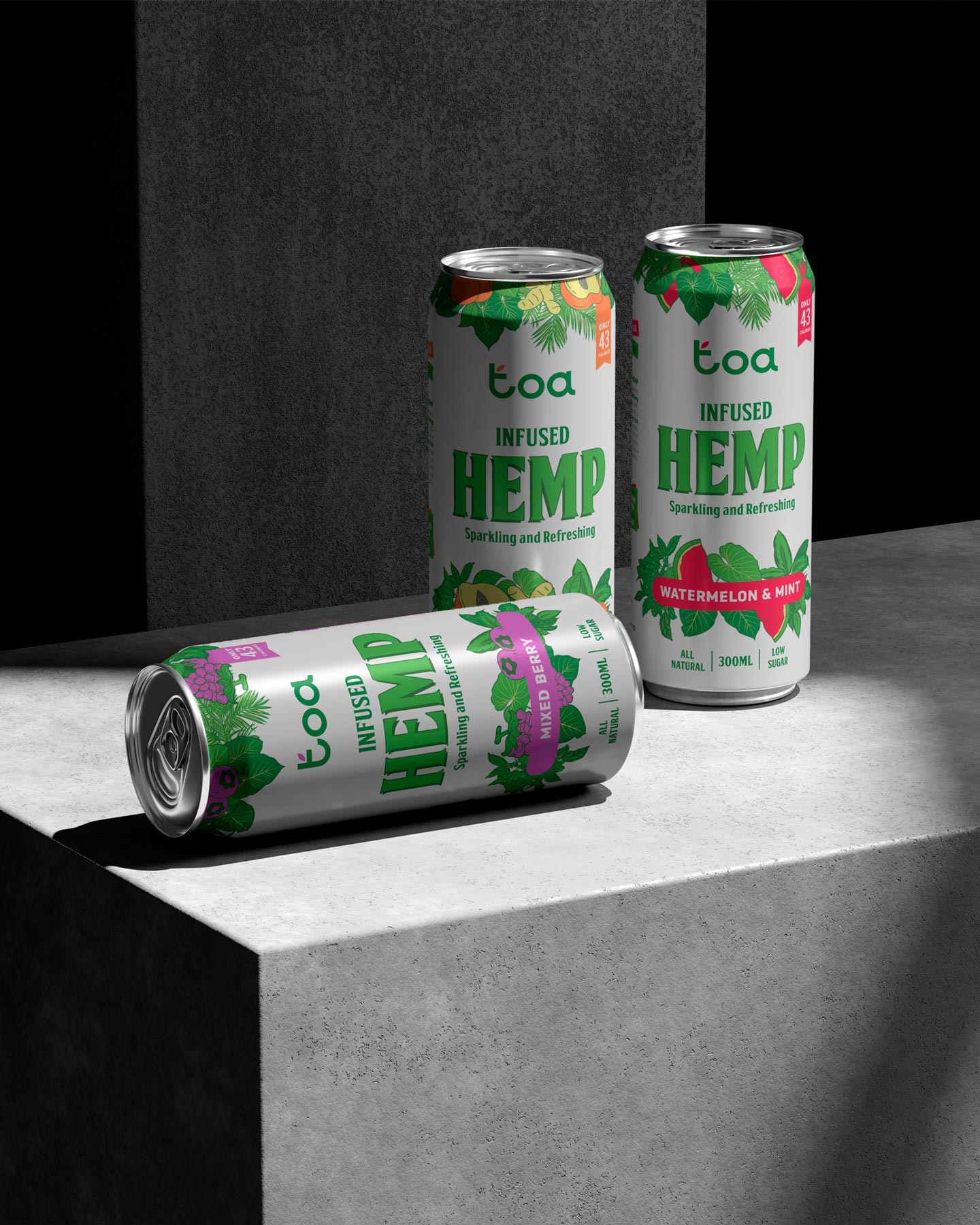
The logo is based on an organic typographic composition with rounded shapes that communicate approachability and freshness. The visual connection between the “t” and the “a” creates a flowing, seamless effect that echoes the natural essence of the product. The vibrant green used in the word “toa” further reinforces its botanical connection. This logo acts as a friendly, recognizable stamp across all flavor variants.
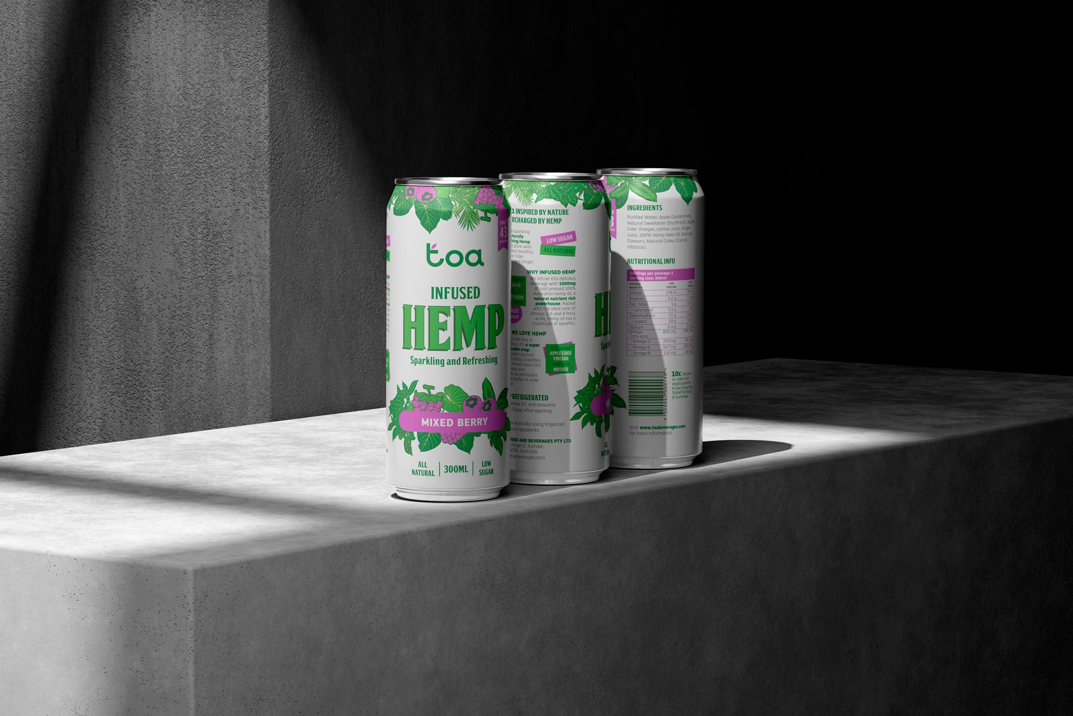
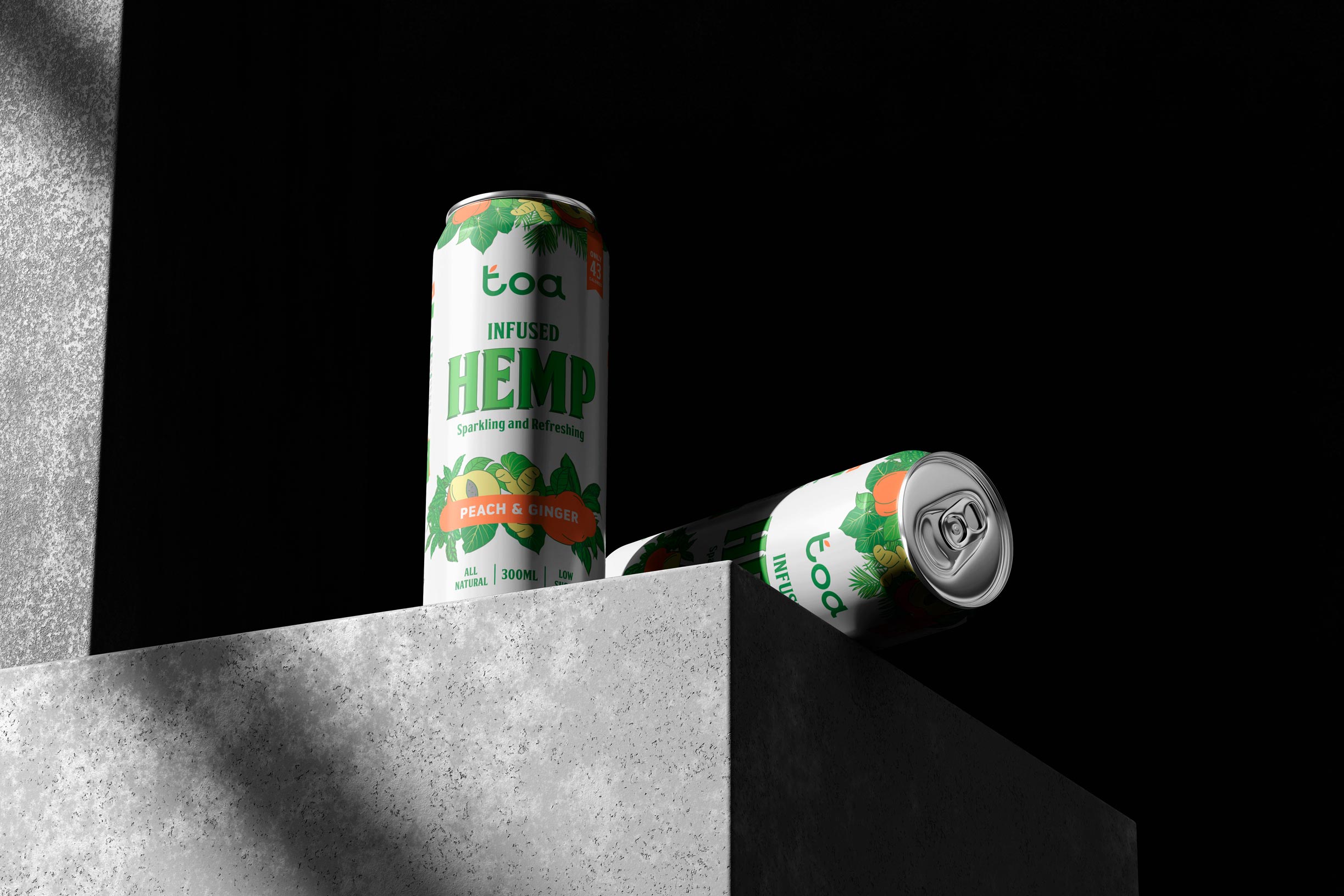
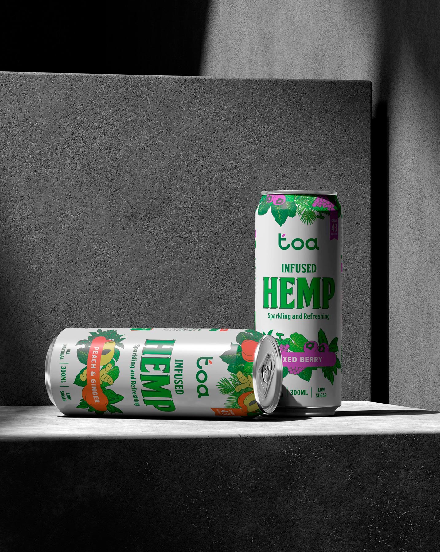
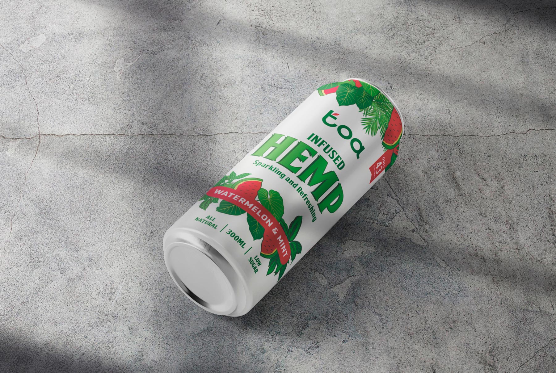
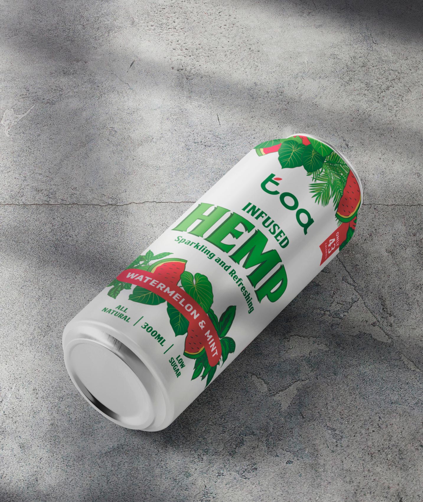
In terms of packaging, we developed a clean, vertical layout where white serves as a breathable base, balancing out the more expressive graphic elements. The word “HEMP” takes center stage on the label, set in a bold, slightly retro typeface that adds personality, character, and strong shelf presence.
The flavor system is resolved through a vibrant, saturated color palette, with a bold color band highlighting each variety—such as bright pink for Watermelon & Mint or violet for Mixed Berry. A botanical illustrated pattern wraps around the base of the can, referencing the key ingredient while creating a refreshing, tropical visual universe that strengthens the brand’s storytelling: healthy, free-spirited, and alive.
Altogether, this project establishes a strong and highly recognizable visual identity, designed for a young, conscious audience that values both aesthetics and the functional benefits of what they consume. Toa emerges as a brand that harmonizes design, nature, and freshness in a modern and honest format.

