


Matcha Waiting For?
Teangle is a contemporary matcha tea brand that blends wellness, energy, and a modern aesthetic. Its visual identity revolves around a clean and functional experience, designed to connect with an audience that wants to take care of their body without giving up attractive design. The challenge was to convey the health benefits of matcha through a fresh, structured, and distinctive visual language.
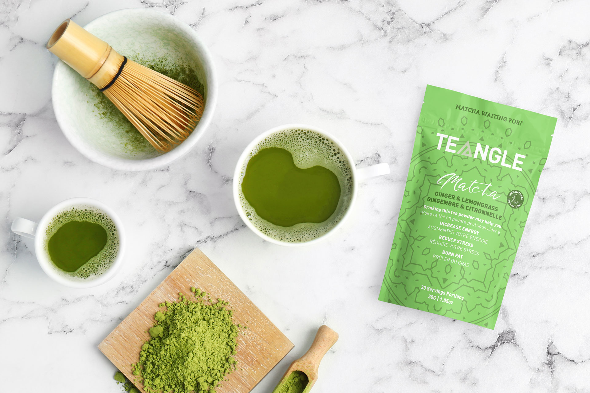
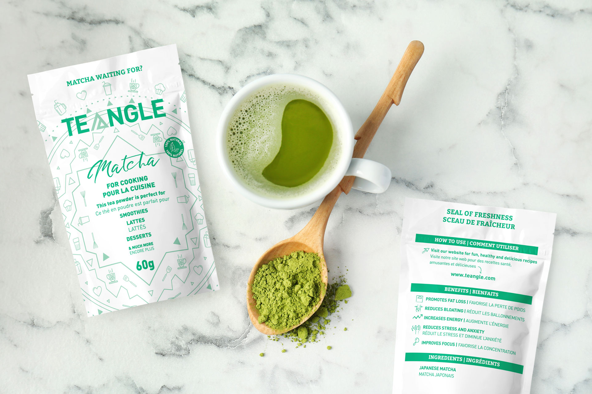
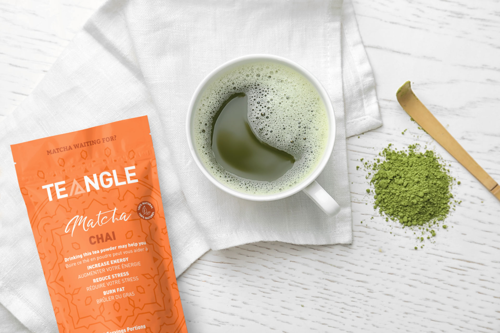
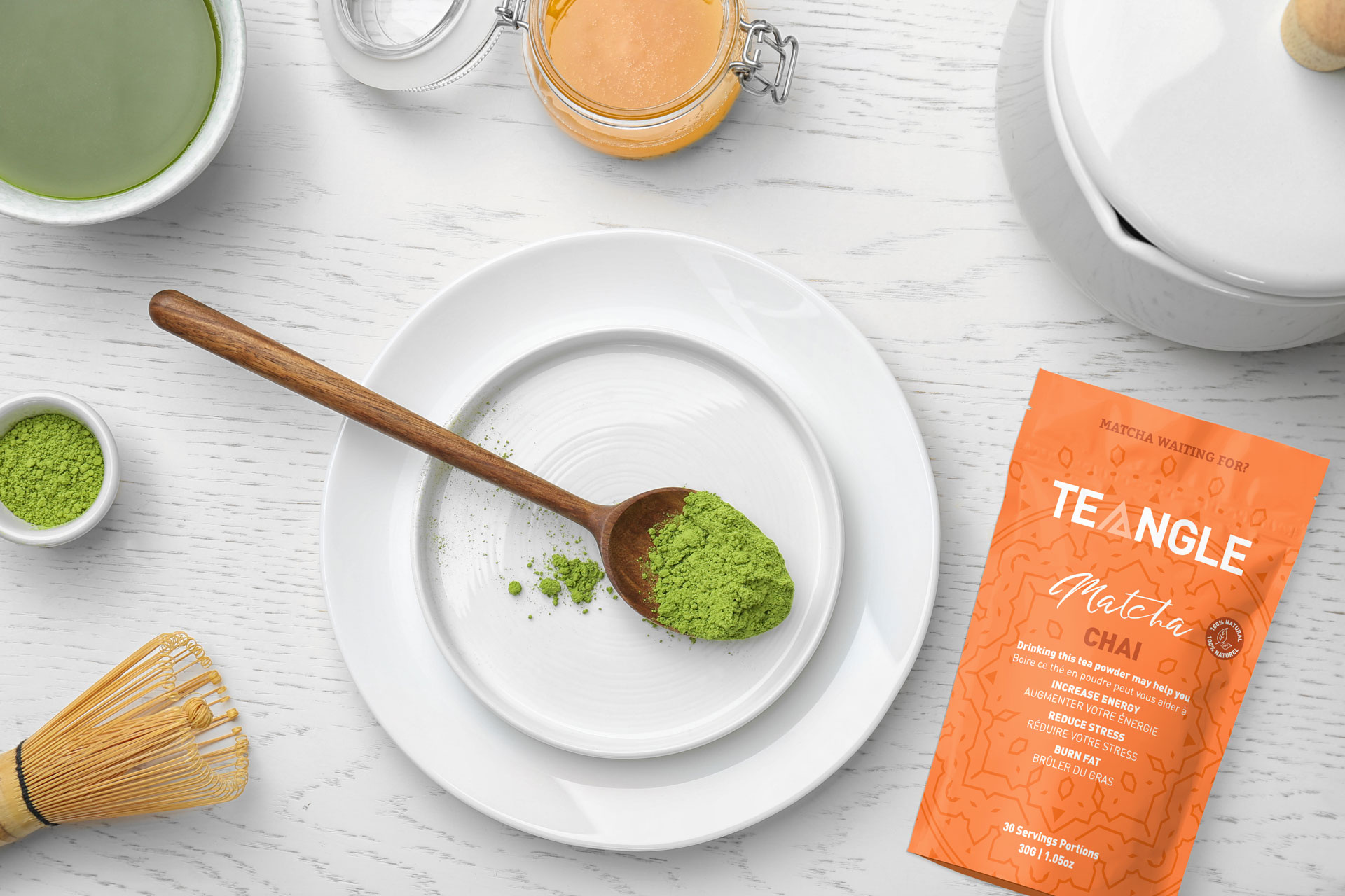
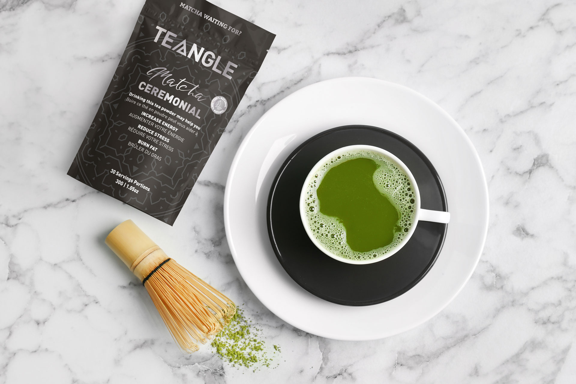
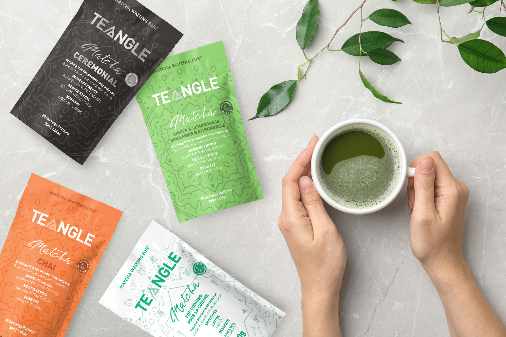
The packaging design is built around a modern, clear typeface, accompanied by fine-line vector illustrations that add texture and detail without overwhelming the design. Each flavor is distinguished by a vibrant, monochromatic color palette, enabling quick product identification and strong shelf presence. The logo includes a graphic play that emphasizes the brand name — TEA + ANGLE — reinforcing the clever and conscious nature of the concept.
The product’s functional benefits are highlighted in a direct and hierarchical way, making for easy and immediate reading — especially helpful for a consumer who values practicality and informative content.
Matcha Ceremonial, Ginger & Lemongrass, Chai, Culinary
Each of the variants reflects a balance between function and emotion. Black conveys the purity and elegance of ceremonial matcha, green highlights the herbal freshness of ginger and lemon, orange brings warmth and spice from the chai, and white denotes the versatility of matcha for cooking. The system remains cohesive across the range, creating a solid yet adaptable brand architecture — ready to grow with new additions in the future.

