


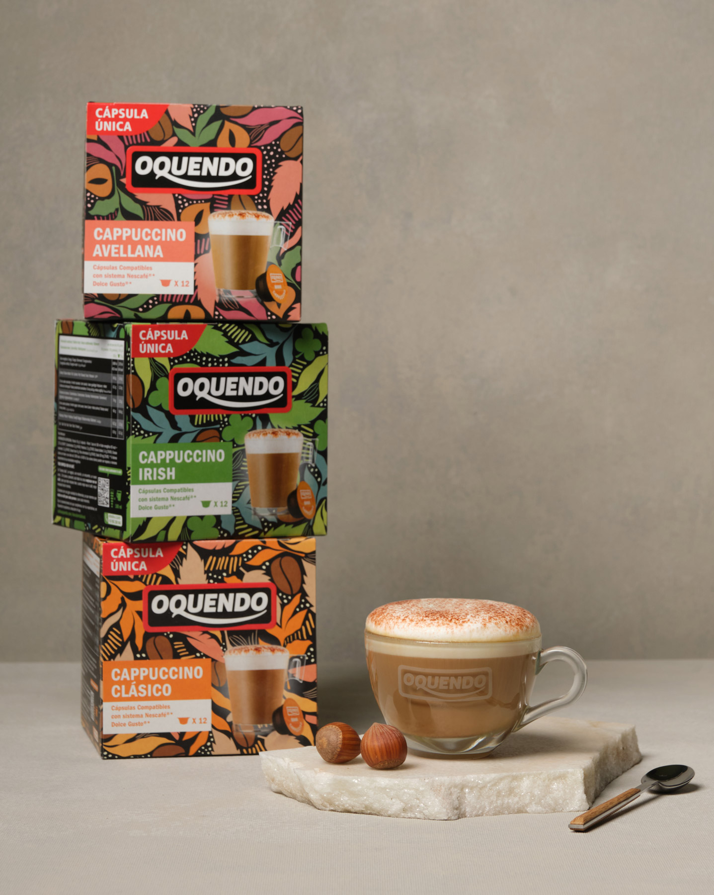
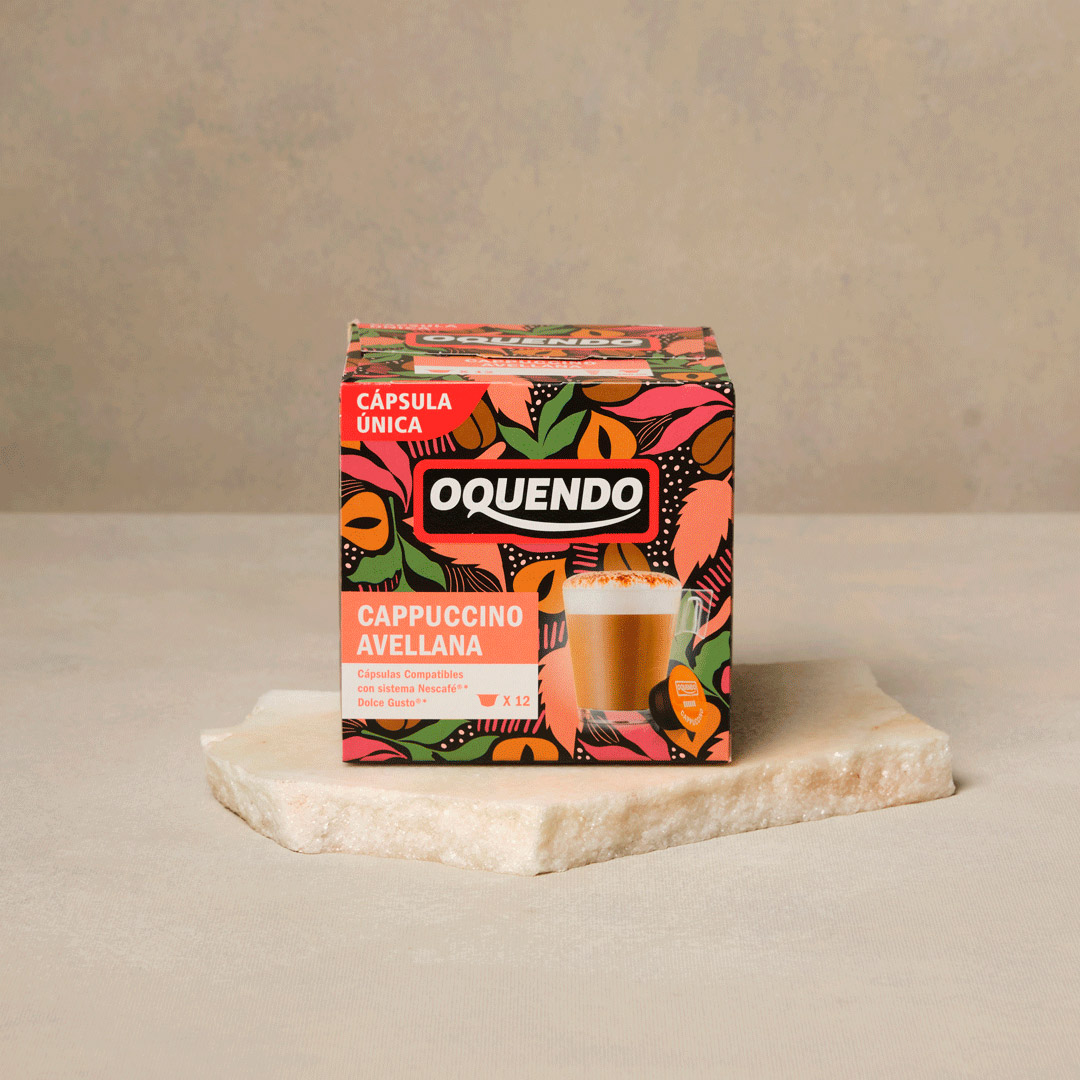
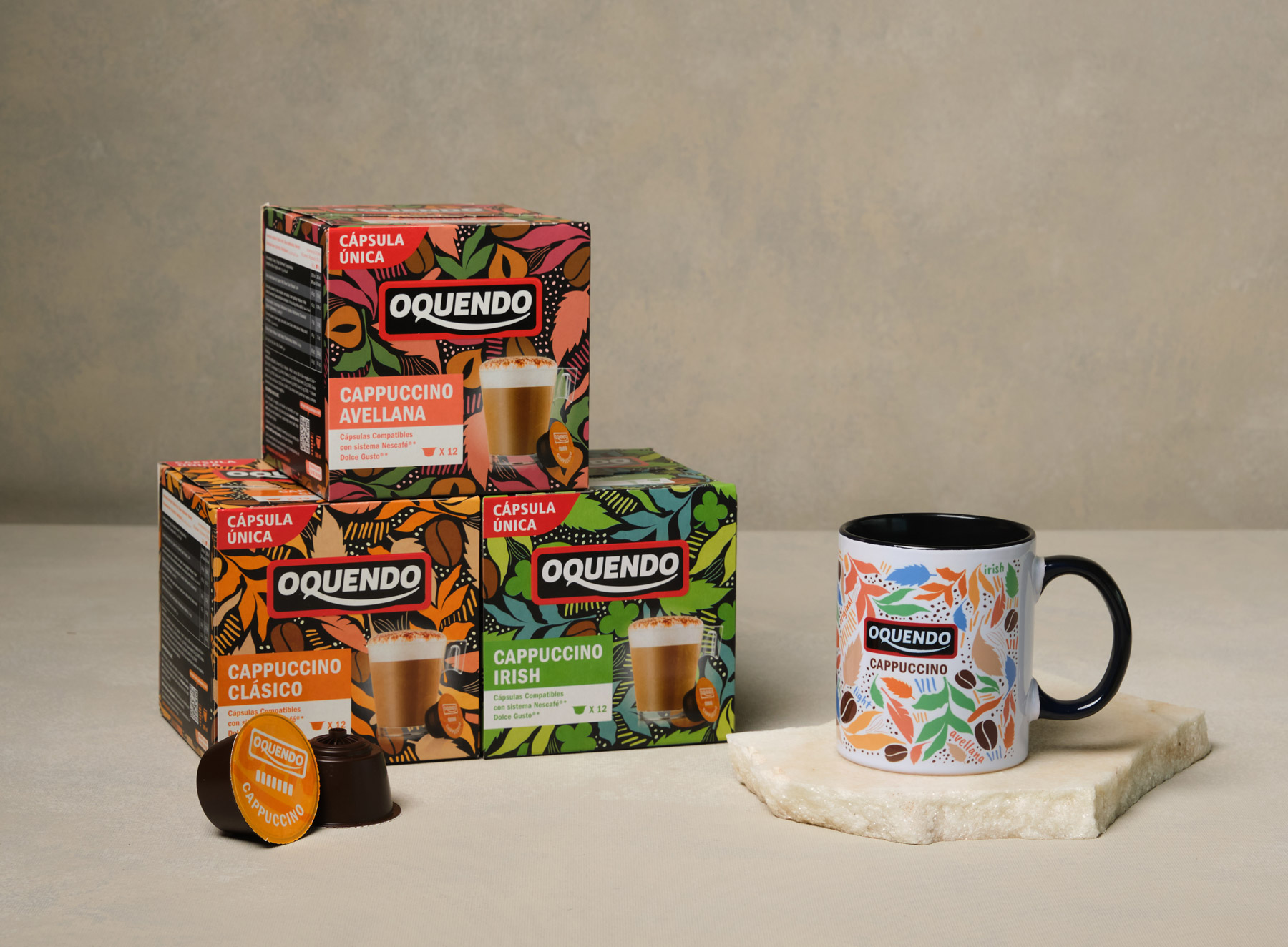
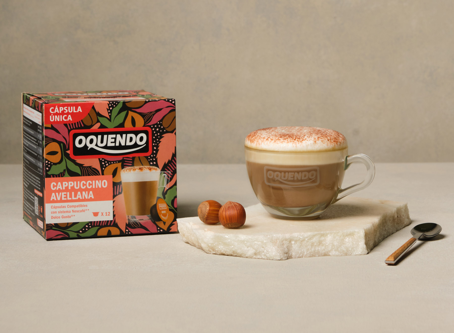
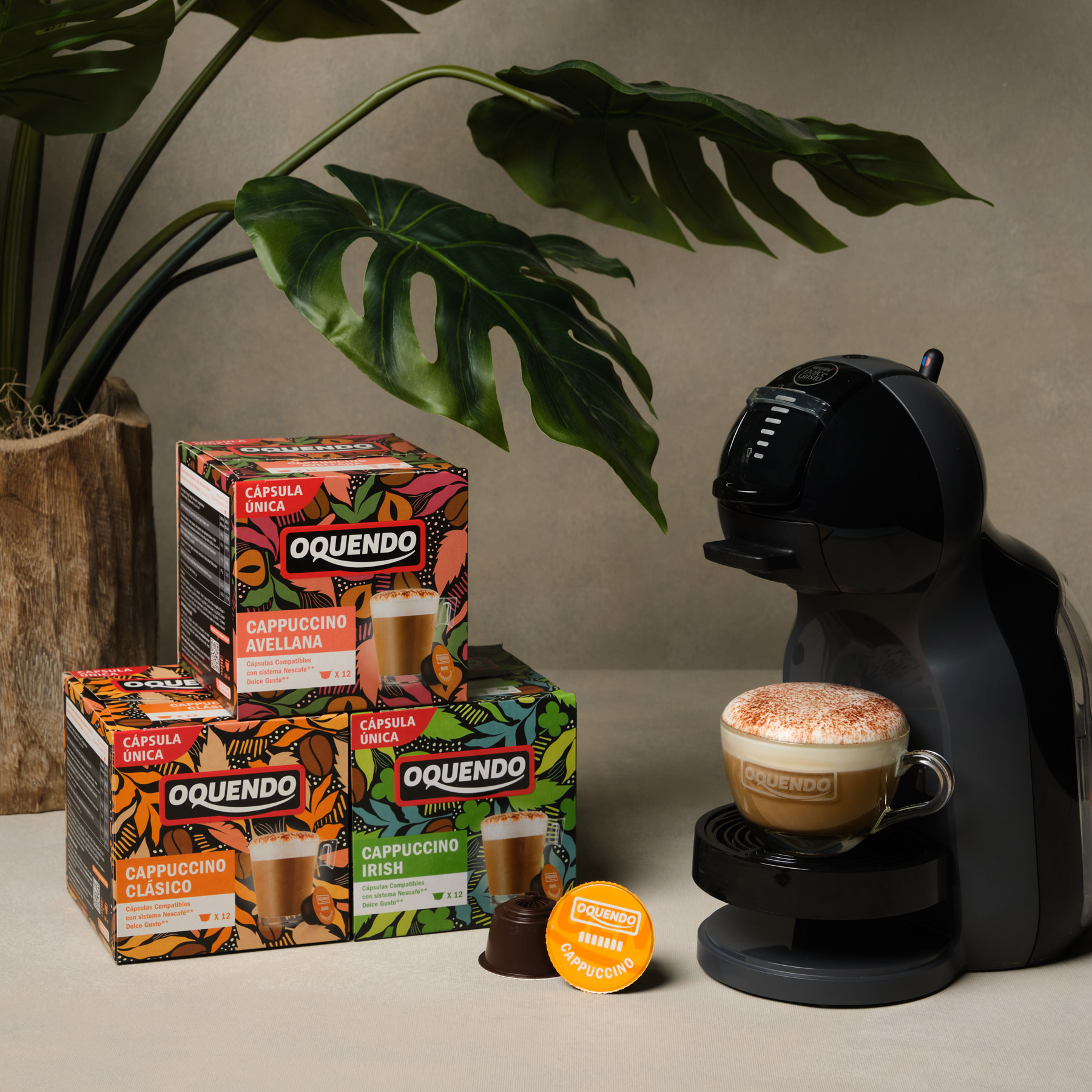
For the redesign of Oquendo’s cappuccino range packaging, the goal was to create a vibrant, contemporary, and instantly recognizable image on the shelf. We developed a graphic system that conveys energy, flavor, and personality—aligned with an indulgent, everyday coffee experience. The visual language is built around organic illustrations, featuring leaves and coffee beans that surround the product in a dynamic, colorful style.
Each variety is clearly distinguished through a specific color palette that reinforces the flavor’s identity (Classic, Hazelnut, Irish…). The logo remains at the center, framed by lively illustrated patterns that add texture and vitality to the composition. This approach strengthens brand recognition and enhances visibility in a highly competitive category.
The result is a design full of life and flavor, enhancing shelf appeal and creating a strong visual and emotional connection with the consumer.

