


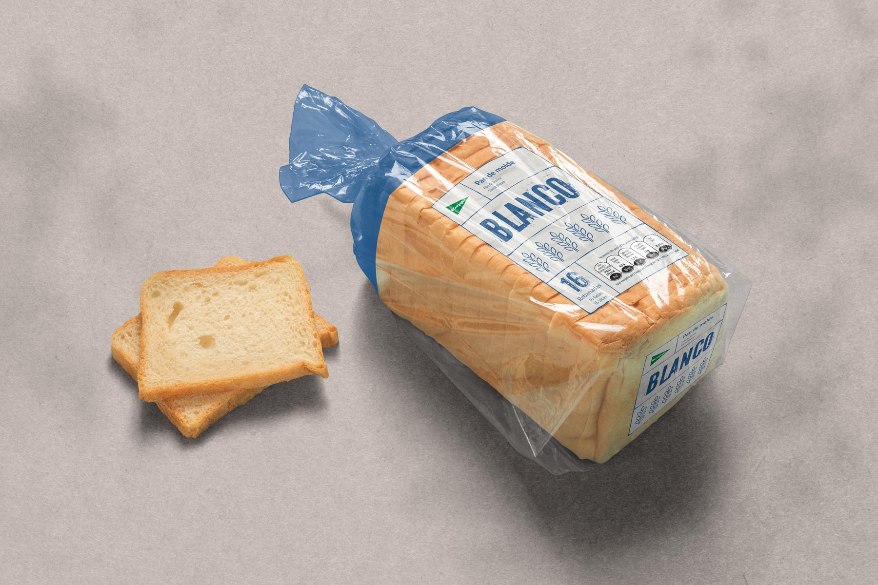
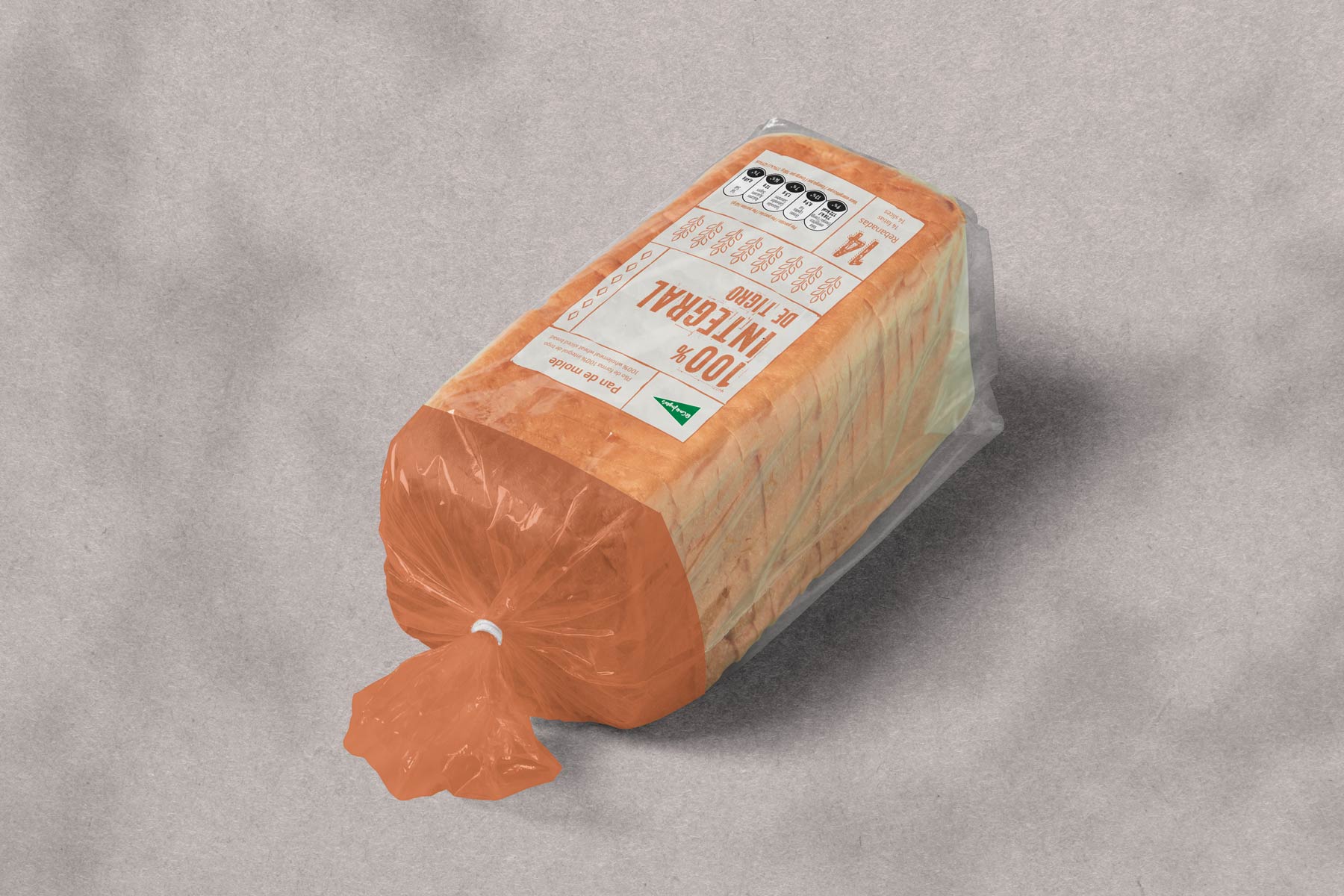
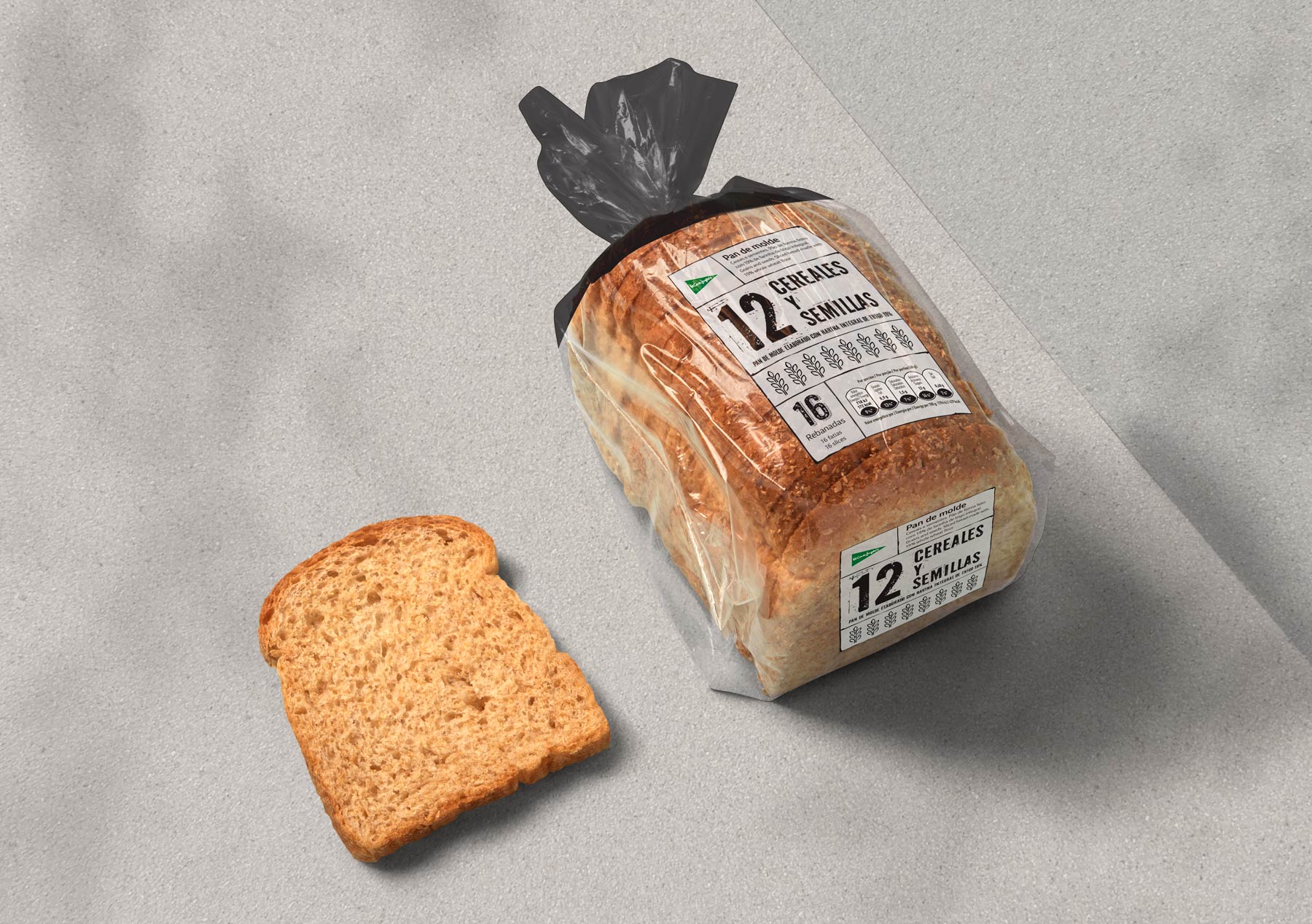
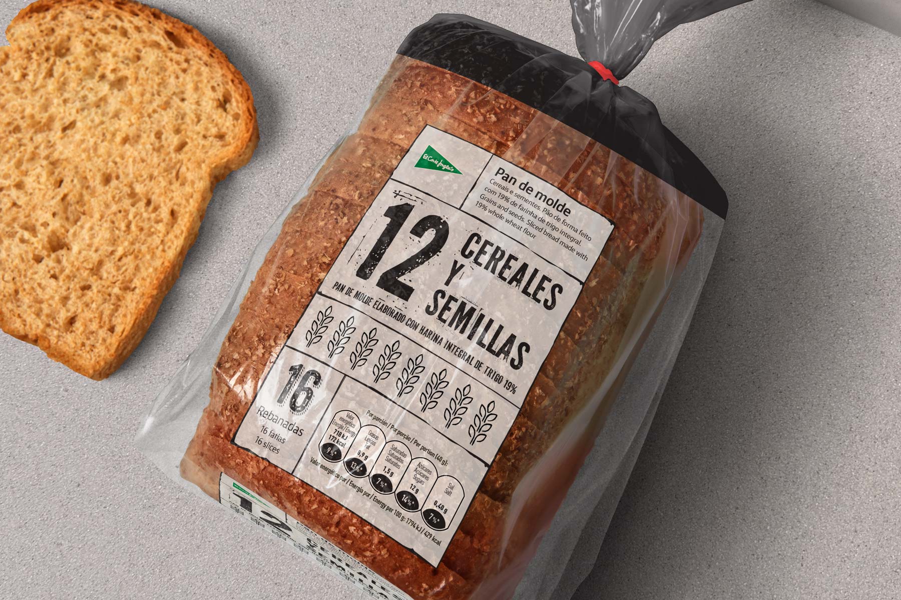
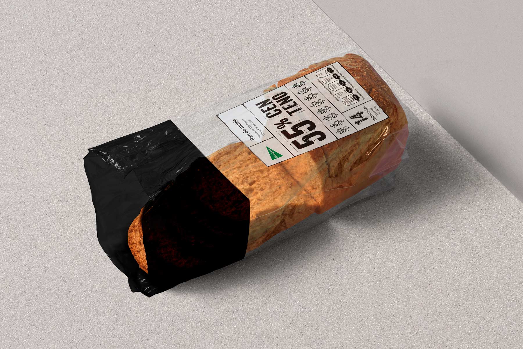
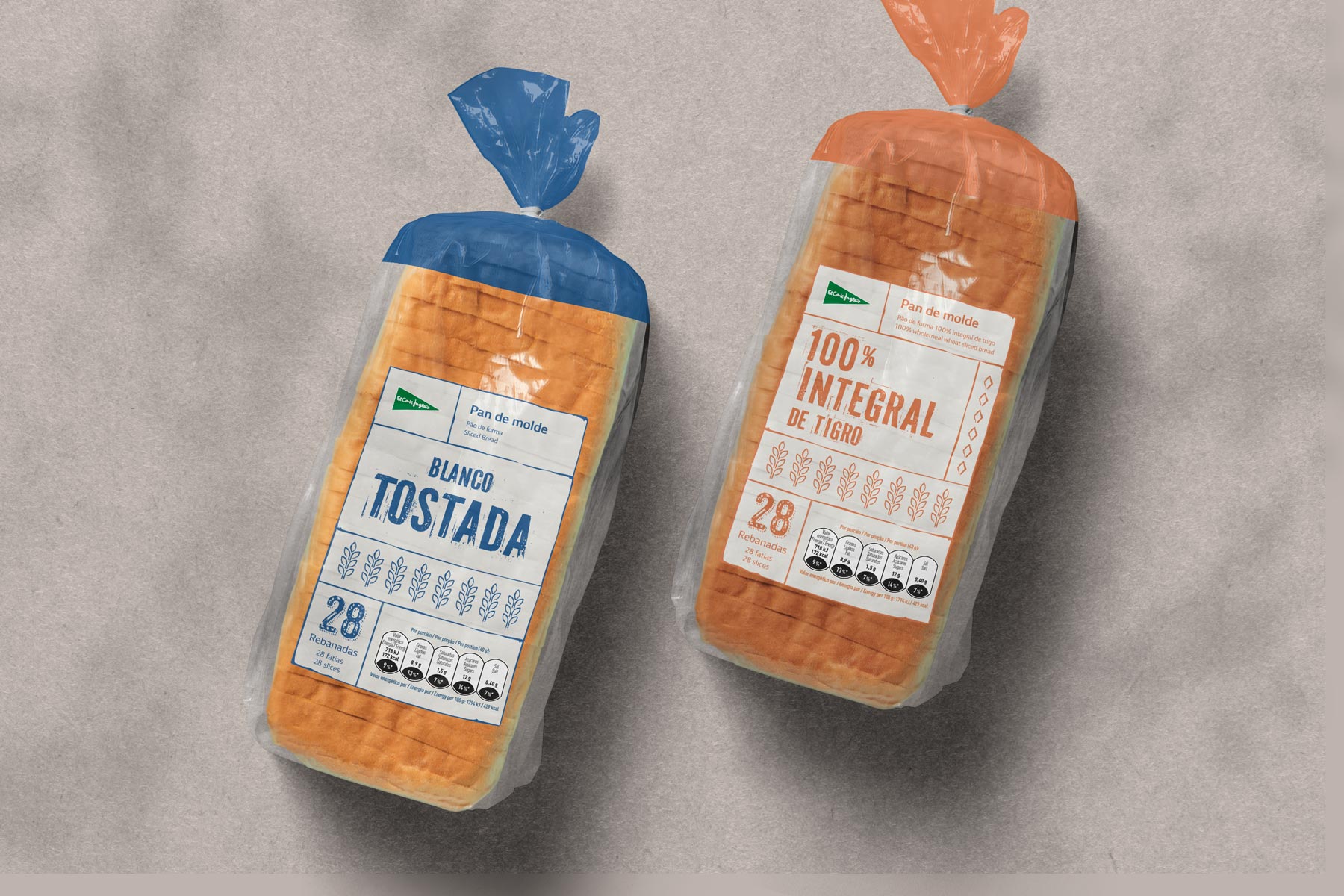
Packaging redesign for El Corte Inglés’ sliced bread range, aiming to improve on-shelf visibility and ensure clear differentiation between product varieties. The new design focuses on clarity, simplicity, and functionality, essential in a product that is part of everyday routines and frequently chosen at a glance. Each variant uses a specific color block and direct typography to allow quick identification of type and characteristics—such as “White Toasted” or “100% Whole Wheat.”
The graphic system, clean and structured, features iconography and nutritional information that is easy to read and understand. The design also respects El Corte Inglés’ visual identity by integrating its brand logo consistently and subtly. The result is a packaging line that communicates transparency, functionality, and trust—key values for a staple product consumed daily.

