


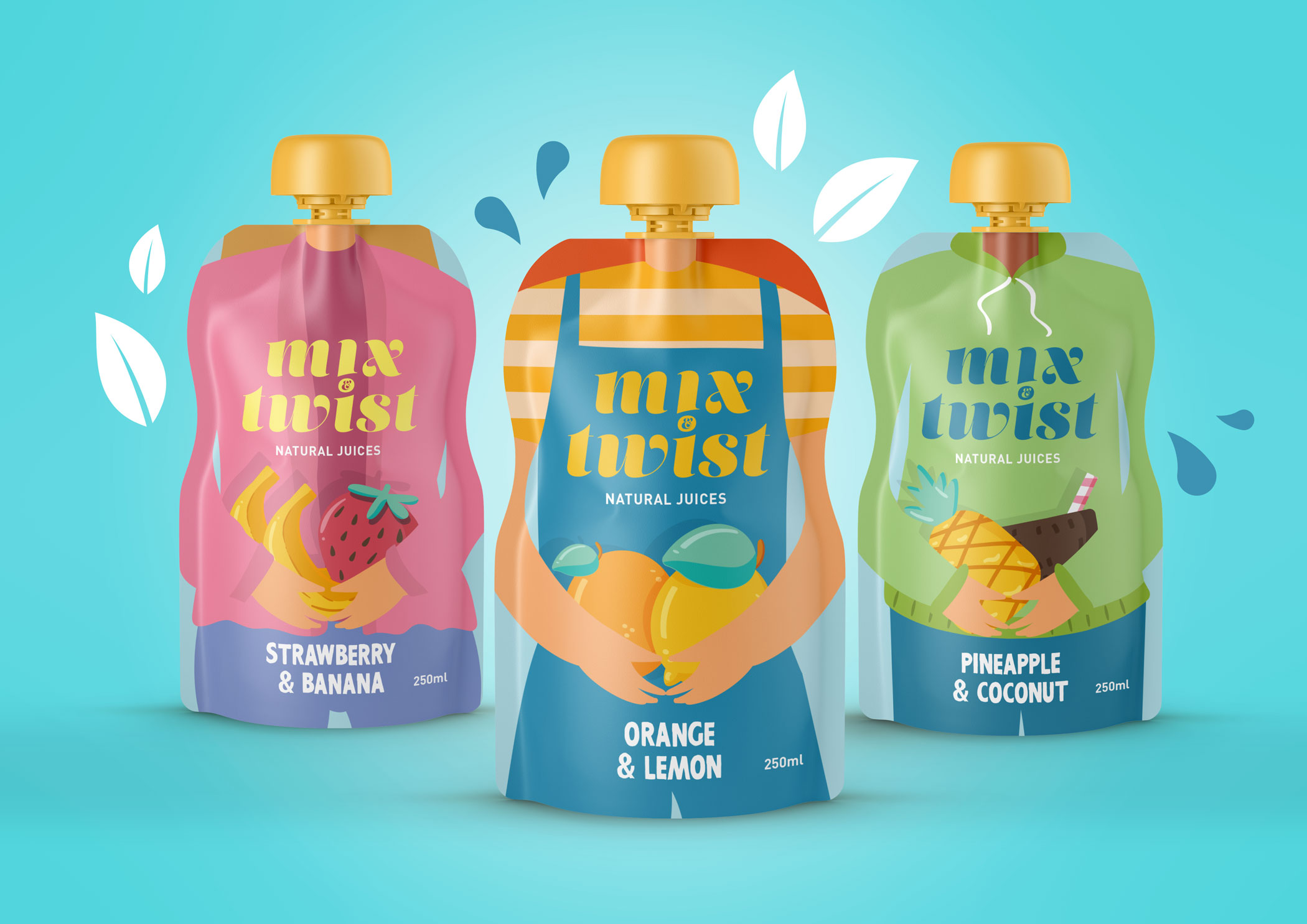
We developed the graphic identity and packaging design for Mix&Twist, a brand of cocktail mixers made from 100% natural juices. Our goal was to create a fresh, expressive and modern identity that communicates both the product’s natural origin and its vibrant, fun character.
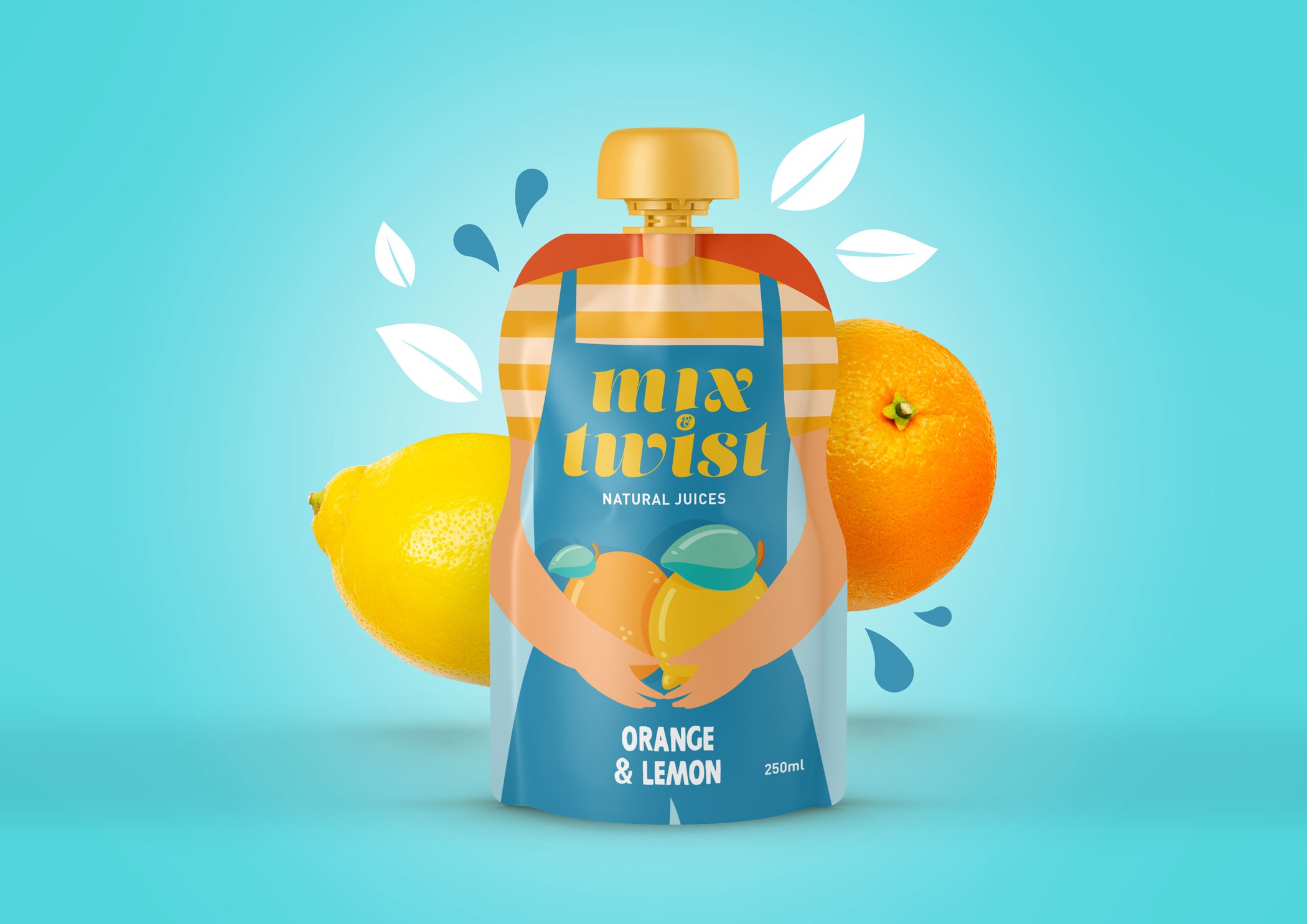
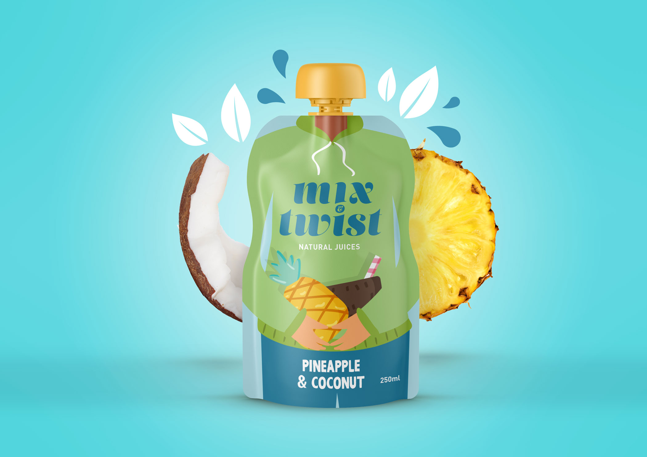
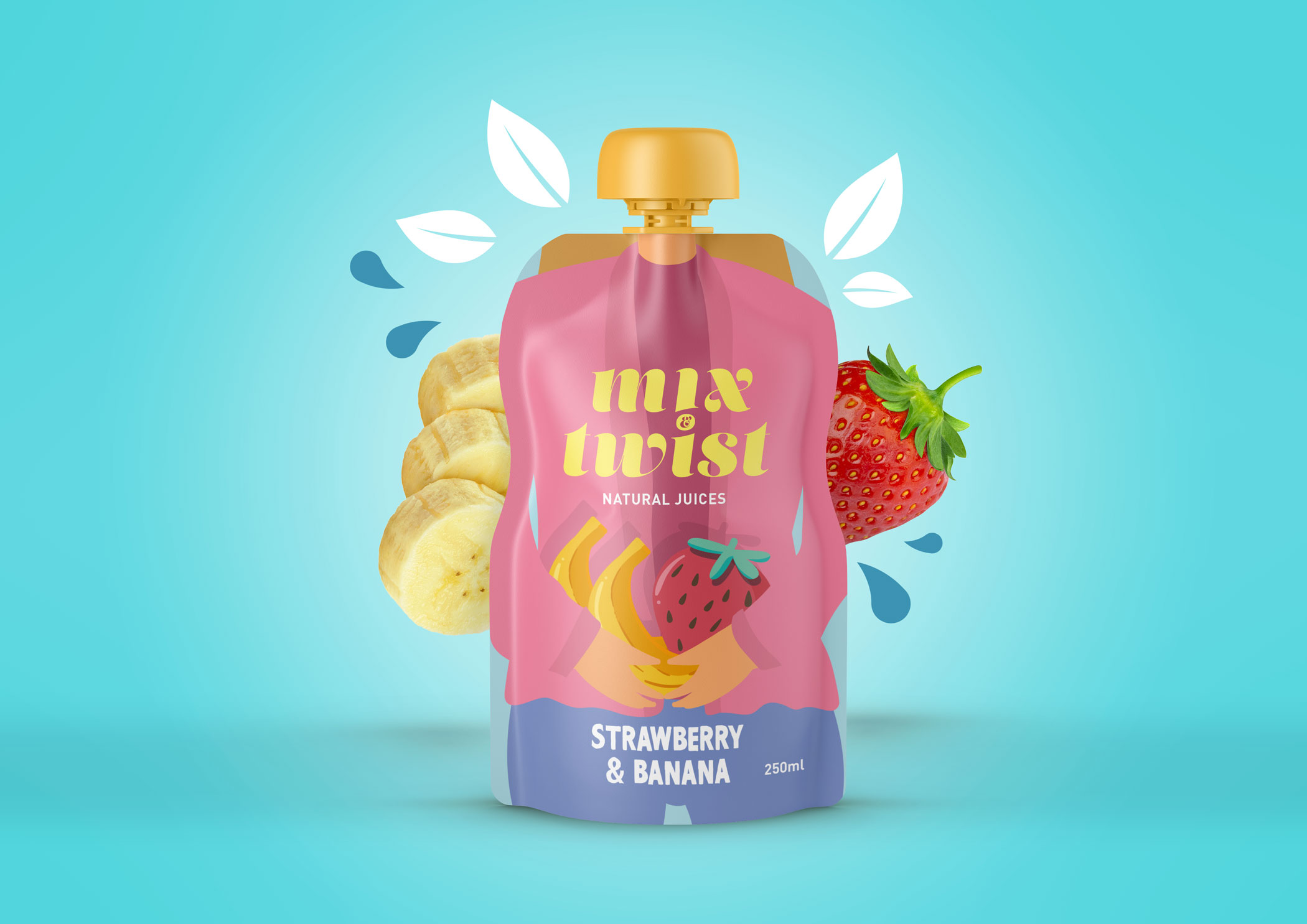
The visual universe of the brand is built around the idea of “twisting” as a central concept. This is reflected in the logo itself, where a subtle curve in the ampersand evokes movement, dynamism, and the idea of blending. The typography is bold and rounded, reinforcing a close and playful tone that aligns with a casual and enjoyable consumption moment.
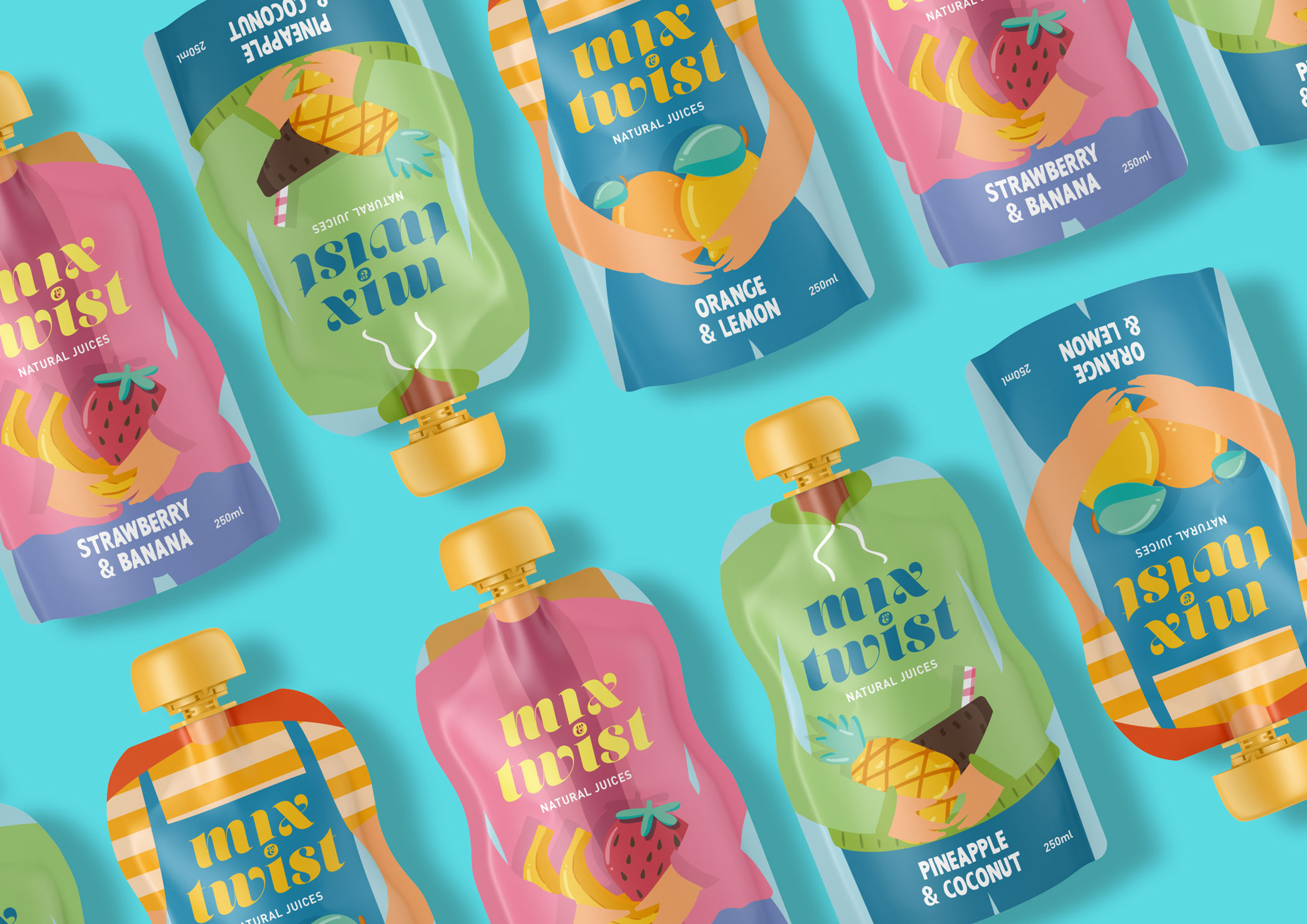
Each flavor in the range is associated with a bright, saturated color that makes it instantly identifiable and speaks to the sensory experience of the drink: vibrant yellow for Pineapple, citrus orange for Orange & Passionfruit, and a bold pink for Strawberry. These colors dominate each label and work as a code to clearly differentiate each variety on the shelf.
On a graphic level, we created abstract patterns using circles and curved lines to evoke fruit pulp, bubbles, and liquid movement. These elements add energy to the design and create a cohesive system across the range.
The result is a packaging system that stands out for its freshness and graphic clarity, connecting with a young and trend-conscious audience who values both design and the natural quality of what they consume.