


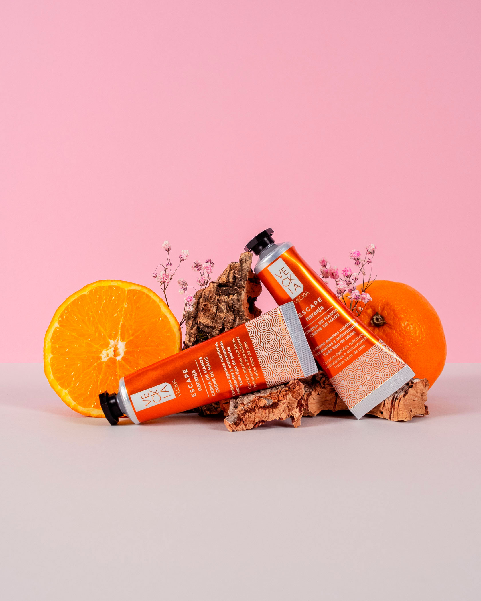
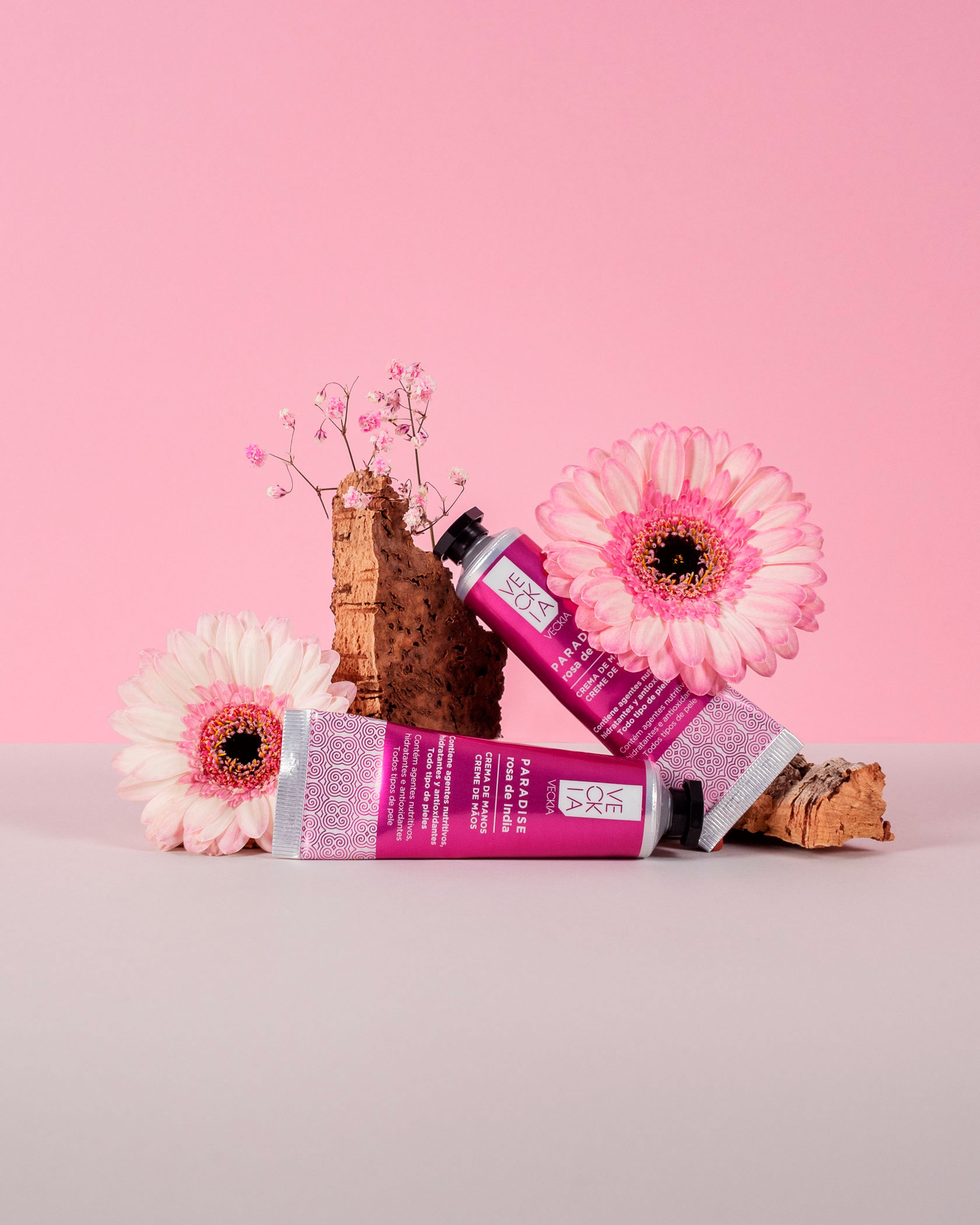
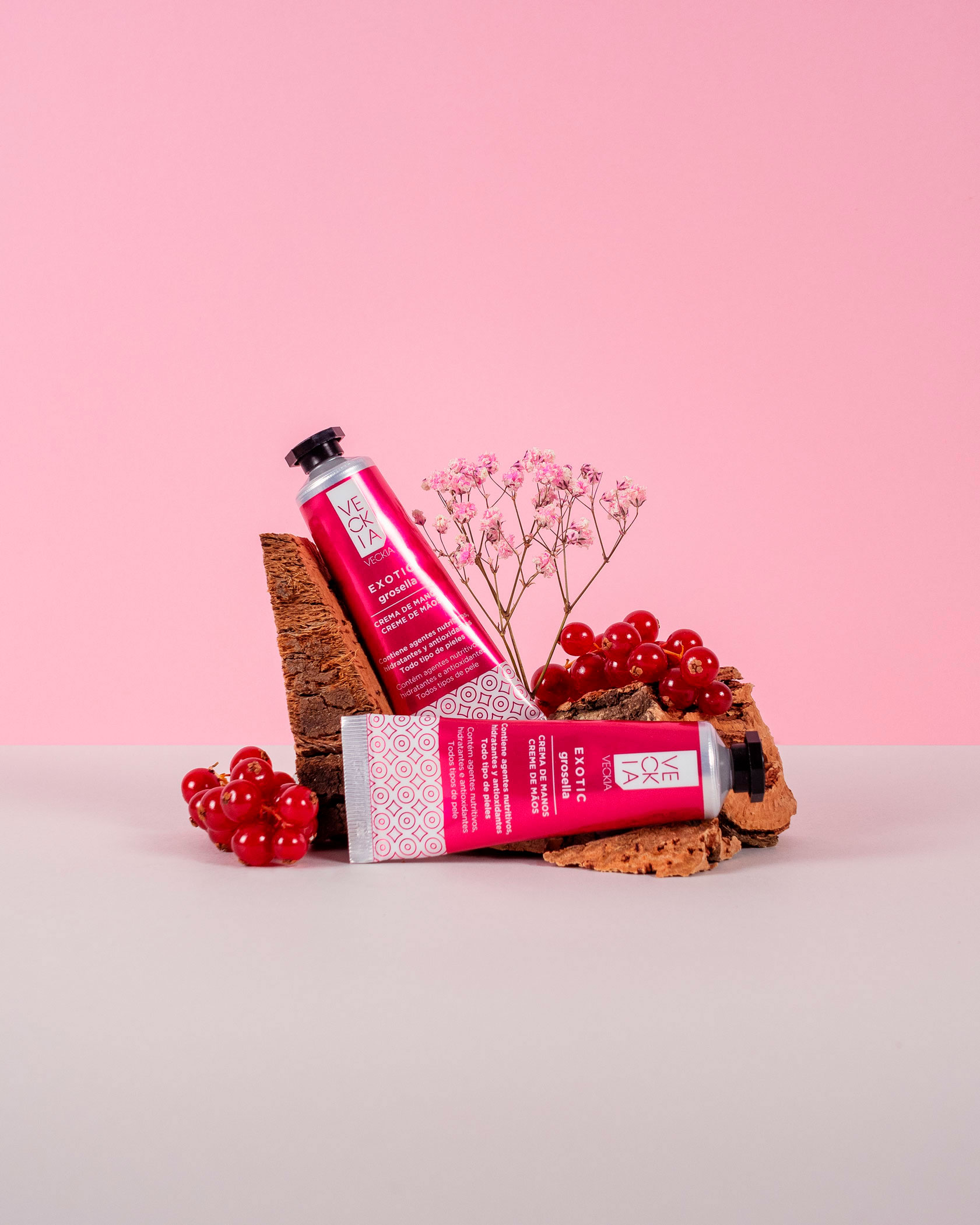
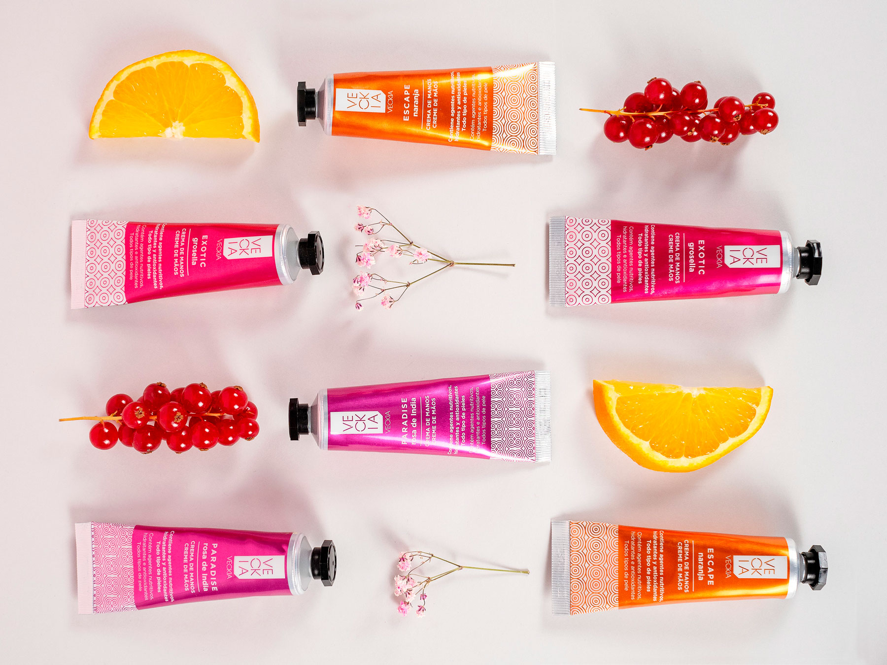
We developed the packaging design for VECKIA’s hand cream line for El Corte Inglés, with the goal of conveying a vibrant, modern, and sophisticated identity aligned with the concept of care and sensory well-being.
The design of the tubes focuses on a fusion of color and geometric patterns to reflect the unique essence of each variant. Each cream is distinguished by a bold and striking tone—fuchsia, red, and orange—that communicates energy, femininity, and warmth, evoking the exotic ingredients in their formulas.
The metallic tubes, finished with a semi-gloss texture, reinforce the perception of a premium, handcrafted product, while the black caps provide an elegant and functional contrast.
The geometric pattern at the base of each package adds a touch of dynamism and visual cohesion to the line, while also evoking inspiration from exotic cultures and artisanal details.
The result is a packaging design that balances function and aesthetics, conveying accessible luxury and a multisensory experience through design.